Authored by Mike Shedlock via MishTalk.com,
Here are some interesting demographic charts that show why finding skilled workers is problematic...
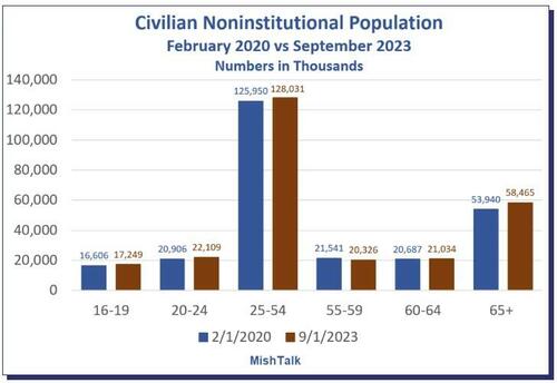
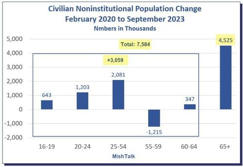
Population data via a BLS download, chart by Mish.
The Civilian Noninstitutional Population consists of those age 16 and older who are not inmates and are not in the military.
The total population change is 7.58 million of which a whopping 4.52 million are in demographic age group 65 and older.
Civilian Noninstitutional Population February 2020 by Age Group
Population data via a BLS download, chart by Mish.
The prime working age population, 25 to 54, grew by 2.08 million but those 65+ expanded by 4.52 million.
The vast majority of those 65+ are retired and most who do work are likely not full time. Unfortunately, the BLS does not have full vs part time status for this age group.
Nonetheless, the overall employment stats are telling.
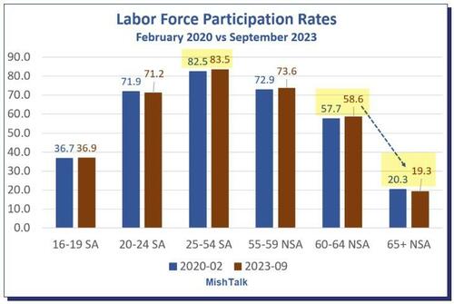
Labor Force Participation Rates February 2020 vs September 2023
Labor Force Participation Rate by age group via a BLS download, chart by Mish. SA = Seasonally-Adjusted.
The labor force participation rate is the percentage of the civilian noninstitutional population 16 years and older that is working or actively looking for work.
SA means Seasonally Adjusted, NSA means not Seasonally Adjusted. I used SA numbers when available because there are huge variances in the propensity to work in the 16 to 19 and 20 to 24 age groups due to school.
The participation rate ticked up slightly for those in age group 25 to 54 while that of age group 65+ ticked slightly lower. This looks positive because the size of age group 25 to 54 is more than double that of 65+.
However, note the steep drop in the propensity to work once one hits age 65. It not quite as bad as it looks if one were to break down 65+ into multiple groups, but it is nasty.
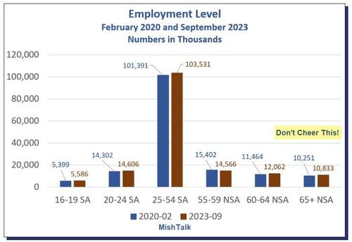
Employment Level February 2020 and September 2023
Employment Level by age group via a BLS download, chart by Mish. SA = Seasonally-Adjusted.
Employment rose across all age groups. But don’t cheer. The comparisons are quite grim.
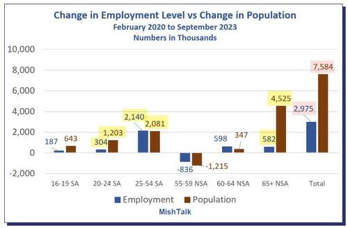
Change in Employment Level vs Change in Population February 2020 to September 2023
Data via a BLS download, calculation and chart by Mish. SA = Seasonally-Adjusted.
The population of age group 65+ rose by 4.52 million but there’s a mere increase in employment by 582 thousand!
We do not know what percentage of people in age groups 60-64 and 65+ are working full time because the BLS does not provide that breakdown.
Demographics Supports the GDI vs GDP View of the Economy
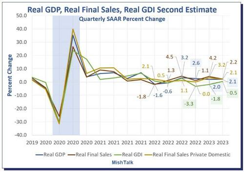
GDP and GDI are two measures of the same thing. Income should match products sold.
The last three quarters of GDP are +2.6%, +2.0%, and +2.1%.
The last three quarters of GDI are -3.3%, -1.8%, and +0.5%.
We will have revised numbers on Thursday.
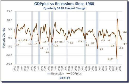
Philadelphia Fed GDPplus Measure Sure Looks Like Recession Started in 2022 Q4
Data from Philadelphia Fed, chart by Mish
GDPplus is a measure of the quarter-over-quarter rate of growth of real output in continuously compounded annualized percentage points.
It’s a blend, but not an average, of Gross Domestic Product (GDP) and Gross Domestic Income (GDI). It is much smoother than either GDP or GDI as the above chart show.
In 100 percent of the cases, with no false signals, no misses, and no lead times more than two quarters, every time GDPplus had two consecutive quarters of negative growth, the economy was in recession.
And except for one negative print of a mere -0.1 percent, the economy was in or would soon go into recession as soon as the first negative GDPplus number surfaced, and stuck.
For discussion of the advantages of GDPplus, please see Philadelphia Fed GDPplus Measure Sure Looks Like Recession Started in 2022 Q4
People believe what they want and certainly Biden along with mainstream media is touting GDP.
The Census numbers are very lagging but match the idea that GDI is the set or numbers to watch.
GDI Matches Demographics
The important point is that GDI matches demographics. Boomers are retiring en masse, replaced by workers of less skill.
This is one of the sore points in the UAW negotiations. Robots are another. See Biden to Join UAW Picket Line as Strike Expands, Good Luck Getting Repairs for discussion.
Please note that retiring boomers means less skilled workers, decreasing productivity, and upward wage pressures which is very inflationary given weak productivity.
Also note there are 12 million people age 60-54 wo are still working and another 10.8 million age 65+. They are all going to retire one way or another sooner rather than later. But as long as they are living, the need for medical care services is poised to skyrocket.
Retirees are generally not unemployed and there are nearly 23 million on deck for retirement.
The demographic factors above are a key reason why I expected minimal rise in unemployment this recession. I have a token, bragging rights bet on this.
Authored by Mike Shedlock via MishTalk.com,
Here are some interesting demographic charts that show why finding skilled workers is problematic…
Population data via a BLS download, chart by Mish.
The Civilian Noninstitutional Population consists of those age 16 and older who are not inmates and are not in the military.
The total population change is 7.58 million of which a whopping 4.52 million are in demographic age group 65 and older.
Civilian Noninstitutional Population February 2020 by Age Group
Population data via a BLS download, chart by Mish.
The prime working age population, 25 to 54, grew by 2.08 million but those 65+ expanded by 4.52 million.
The vast majority of those 65+ are retired and most who do work are likely not full time. Unfortunately, the BLS does not have full vs part time status for this age group.
Nonetheless, the overall employment stats are telling.
Labor Force Participation Rates February 2020 vs September 2023
Labor Force Participation Rate by age group via a BLS download, chart by Mish. SA = Seasonally-Adjusted.
The labor force participation rate is the percentage of the civilian noninstitutional population 16 years and older that is working or actively looking for work.
SA means Seasonally Adjusted, NSA means not Seasonally Adjusted. I used SA numbers when available because there are huge variances in the propensity to work in the 16 to 19 and 20 to 24 age groups due to school.
The participation rate ticked up slightly for those in age group 25 to 54 while that of age group 65+ ticked slightly lower. This looks positive because the size of age group 25 to 54 is more than double that of 65+.
However, note the steep drop in the propensity to work once one hits age 65. It not quite as bad as it looks if one were to break down 65+ into multiple groups, but it is nasty.
Employment Level February 2020 and September 2023
Employment Level by age group via a BLS download, chart by Mish. SA = Seasonally-Adjusted.
Employment rose across all age groups. But don’t cheer. The comparisons are quite grim.
Change in Employment Level vs Change in Population February 2020 to September 2023
Data via a BLS download, calculation and chart by Mish. SA = Seasonally-Adjusted.
The population of age group 65+ rose by 4.52 million but there’s a mere increase in employment by 582 thousand!
We do not know what percentage of people in age groups 60-64 and 65+ are working full time because the BLS does not provide that breakdown.
Demographics Supports the GDI vs GDP View of the Economy
GDP and GDI are two measures of the same thing. Income should match products sold.
The last three quarters of GDP are +2.6%, +2.0%, and +2.1%.
The last three quarters of GDI are -3.3%, -1.8%, and +0.5%.
We will have revised numbers on Thursday.
Philadelphia Fed GDPplus Measure Sure Looks Like Recession Started in 2022 Q4
Data from Philadelphia Fed, chart by Mish
GDPplus is a measure of the quarter-over-quarter rate of growth of real output in continuously compounded annualized percentage points.
It’s a blend, but not an average, of Gross Domestic Product (GDP) and Gross Domestic Income (GDI). It is much smoother than either GDP or GDI as the above chart show.
In 100 percent of the cases, with no false signals, no misses, and no lead times more than two quarters, every time GDPplus had two consecutive quarters of negative growth, the economy was in recession.
And except for one negative print of a mere -0.1 percent, the economy was in or would soon go into recession as soon as the first negative GDPplus number surfaced, and stuck.
For discussion of the advantages of GDPplus, please see Philadelphia Fed GDPplus Measure Sure Looks Like Recession Started in 2022 Q4
People believe what they want and certainly Biden along with mainstream media is touting GDP.
The Census numbers are very lagging but match the idea that GDI is the set or numbers to watch.
GDI Matches Demographics
The important point is that GDI matches demographics. Boomers are retiring en masse, replaced by workers of less skill.
This is one of the sore points in the UAW negotiations. Robots are another. See Biden to Join UAW Picket Line as Strike Expands, Good Luck Getting Repairs for discussion.
Please note that retiring boomers means less skilled workers, decreasing productivity, and upward wage pressures which is very inflationary given weak productivity.
Also note there are 12 million people age 60-54 wo are still working and another 10.8 million age 65+. They are all going to retire one way or another sooner rather than later. But as long as they are living, the need for medical care services is poised to skyrocket.
Retirees are generally not unemployed and there are nearly 23 million on deck for retirement.
The demographic factors above are a key reason why I expected minimal rise in unemployment this recession. I have a token, bragging rights bet on this.
Loading…
