Authored by Chris Macintosh via InternationalMan.com,
As each year passes, we have come to appreciate Bob Farrell’s 10 Investment Rules.
Perhaps this is because we have been through “a few” cycles and have seen his “rules” play out:
-
Markets tend to return to the mean over time.
-
Excesses in one direction will lead to an opposite excess in the other direction.
-
There are no new eras; excesses are never permanent.
-
Exponential rapidly rising or falling markets usually go further than you think, but they do not correct by going sideways.
-
The public buys the most at the top and the least at the bottom.
-
Fear and greed are stronger than long-term resolve.
-
Markets are strongest when they are broad, and weakest when they narrow to a handful of blue-chip names.
-
Bear markets have three stages — sharp down, reflexive rebound, and a drawn-out fundamental downtrend.
-
When all the experts and forecasts agree, something else is going to happen.
-
Bull markets are more fun than bear markets.
Granted, these are all rather subjective general “rules”. In hindsight one can see them working, however, when you are in the “here and now” it is always somewhat more challenging.
When you identify a condition of “excess,” there is nothing to say that these excesses will end shortly thereafter. Excesses (new highs or lows) or a topping/bottoming process can go on for a lot longer than you could ever rationally comprehend… as you will see in the charts below. But eventually, these excesses do come to an end for reasons you probably didn’t think of at the time. The returns generated as they mean revert provide such beautiful asymmetry.
Take a look at the “excesses” occurring in macro investment themes listed below (no prizes for guessing that we are positioned for a reversal of these trends).
Value vs Growth
First, let’s recap on the essence of value vs growth:
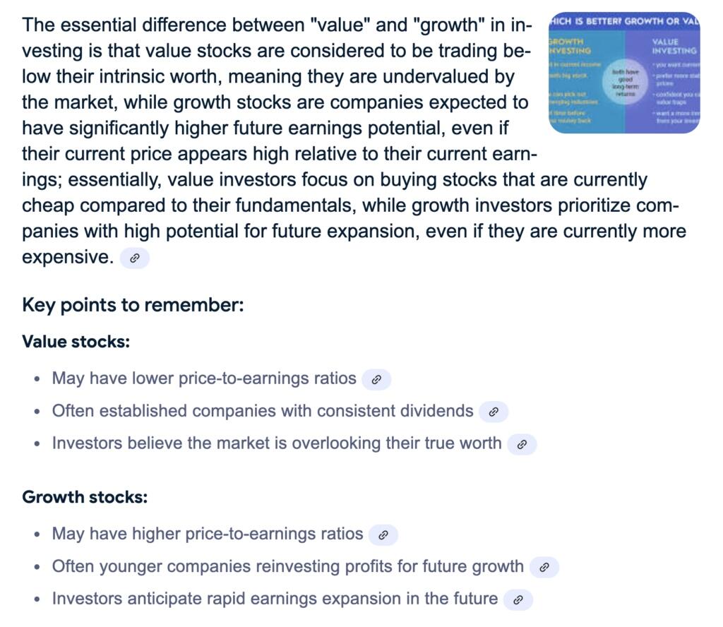
One could say that the difference comes down to growth expectations. In other words, growth of future earnings.
In the US, “value” as an investment theme relative to “growth” is more or less at a 40-year low.
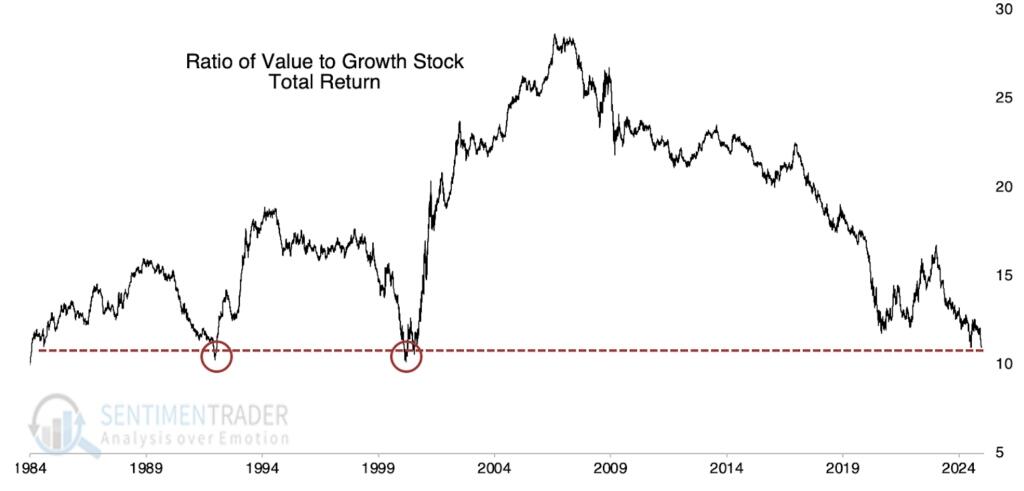
US value vs US growth
From a global perspective, value is as out of favour as it has ever been since the early 1970s and far eclipsing the records set during the dot-com lunacy 25 years ago. It would be interesting if the chart below went back another 50 years.
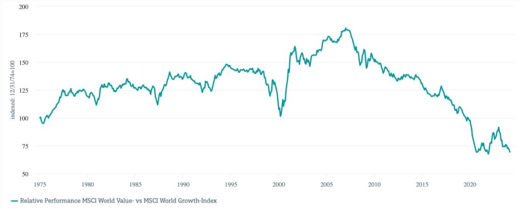
World value vs world growth
It is not just a large cap thing. The same also extends to small caps.
US small cap value vs small cap growth
What few have thought about is the ability of “growth” stocks to grow. Many of these companies are now bigger than entire national stock markets.
The Magnificent 7 now account for an eye watering 25% of the market cap of the world stock market (MSCI World).
Surely, the growth rate of these stocks must revert to that of the world stock market? Well, we think so. We believe growth expectations of the Mag 7 will go down as one of the grandest of delusions of all times. Imagine companies becoming larger than countries (when measured by market cap), and furthermore, consider how probable it is for these companies to grow faster than GDP growth rates of countries.
Let’s put it in a slightly different way, for Microsoft to double in value, it needs to attract the same value as the entire French stock market (thereabouts).
Small Caps vs Large Caps
Small caps are about as unloved as they were during the height of the TMT bubble in the late 1990s.
Russell 2000 Index vs S&P 500, both indexed to 100
World vs US Equity Markets
An extreme? Hard to argue that it isn’t. The only debate is the magnitude of the extreme.
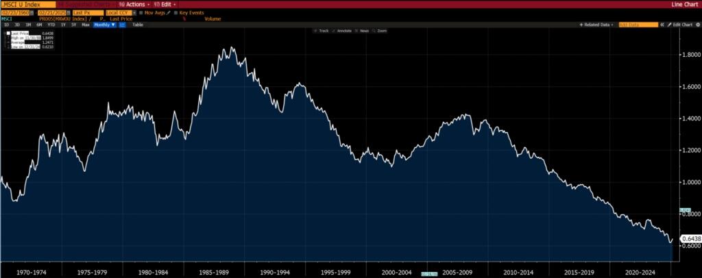
MSCI World Ex-US vs MSCI World, both indexed to 100
Emerging Markets vs World Equity Markets
Emerging markets are as out of favour as they were in the late 1990s, after the Asian tiger and LTCM crisis.
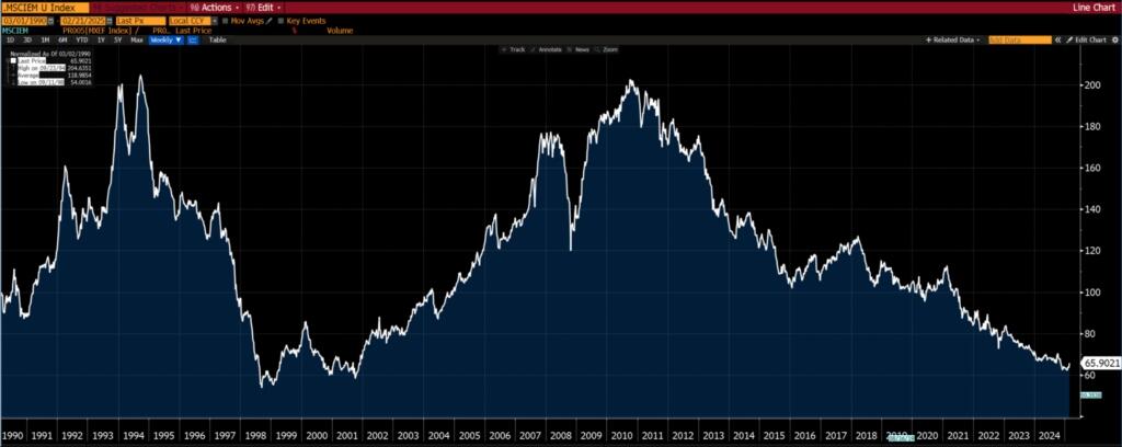
MSCI Emerging Markets vs MSCI World, both indexed to 100
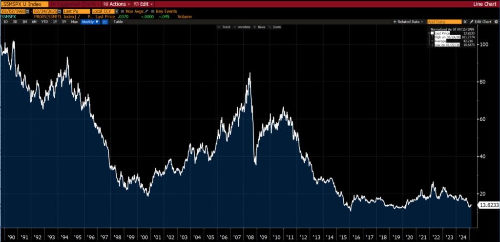
Energy vs S&P 500
From a sector perspective, energy has never had such a low weighting in the S&P 500. The chart below (the longest time frame we could find) only goes to mid-2020.
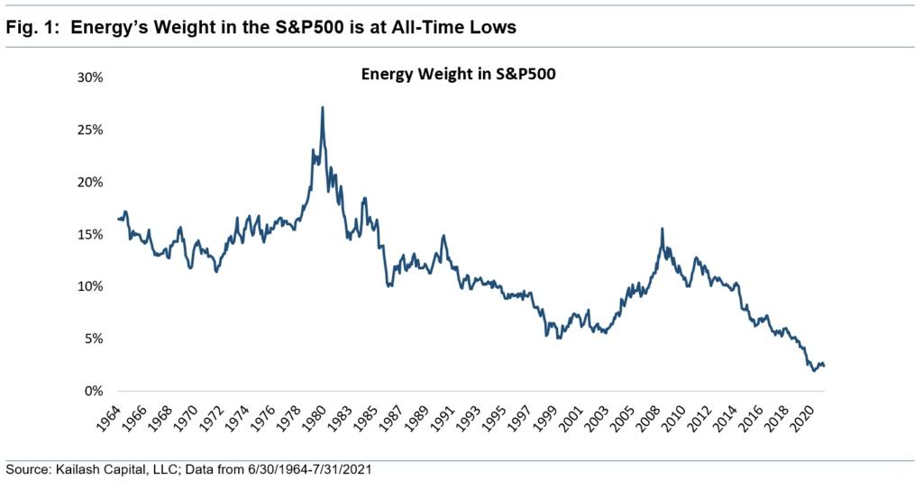
However, if we look at the relative performance of the S&P 500 Energy sector and the S&P 500, you will see that the performance is comparable to 2021 (i.e. the weighting of energy stocks in the S&P 500 hasn’t changed much since late 2020).
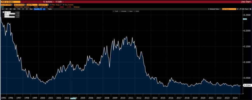
Gold Miners vs S&P 500
Almost a replication of the chart above, but notice the long term bottoming formation.
And mining stocks (the S&P 500 Metals and Mining Index which the XME ETF tracks) relative to the S&P 500.
Energy vs Mining
The foregoing discussion begs the question, is energy more out of favour than mining?
If you want a yes/no answer, then yes. Value is easier to find in energy oriented sectors rather than mining.
However, if you give a time frame then things are not black and white. Over the last 10 years, the answer is still yes. But over 20 years and more, there isn’t a clear winner/loser.
S&P 500 Energy Index (XLE) vs S&P Metals and Mining (XME), both indexed to 100
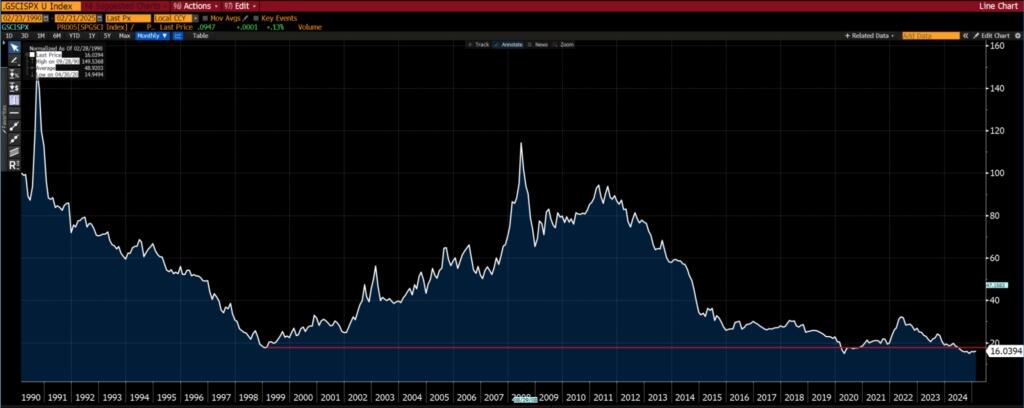
Commodities vs S&P 500
To round it all off, taking the S&P GSCI (the Goldman Commodity Index) as a proxy for the commodity sector (only because it has the longest history)…
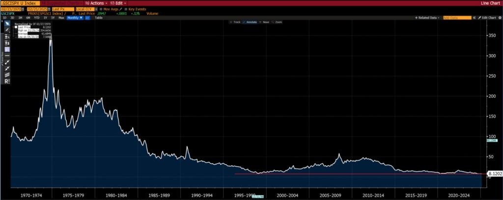
Taking the last 35 years, commodities relative to equities are as toxic as they were in the late 1990s. We remember that time. No one wanted to touch them with a 40-foot barge pole, least of all commodity sensitive stocks.
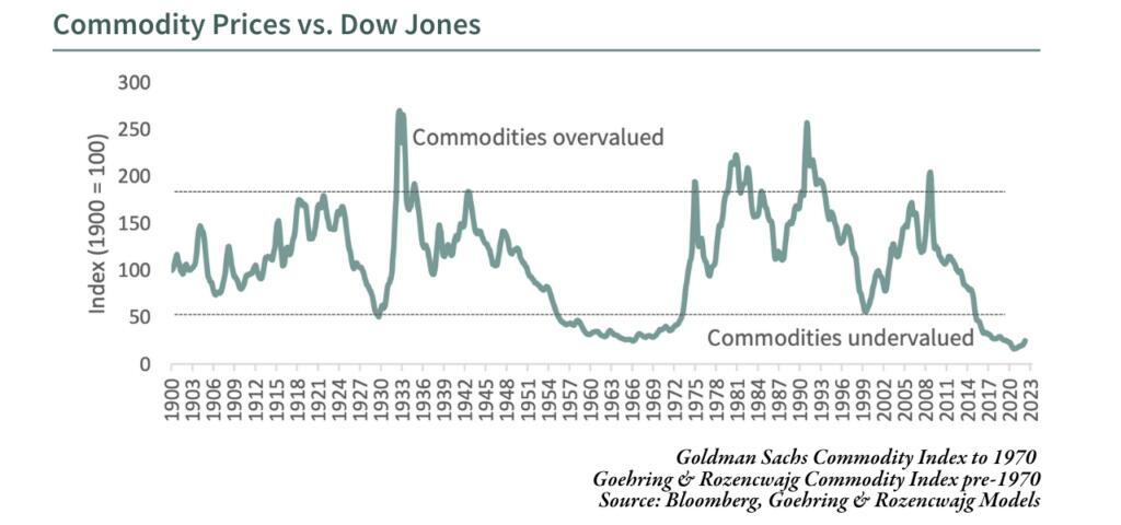
Of course, there is this famous ultra-long term chart produced by Goering and Rozencwajg:
And this one:
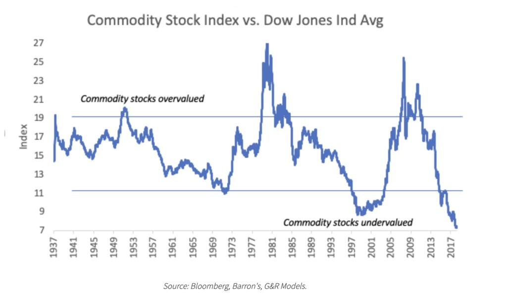
Granted, it is some five years old but levels have not changed any since then (using charts above as a proxy).
So in light of the charts above, what is the market implying?
In essence, the market is as perfectly positioned for benign inflation and relatively low interest rates over the next decade as it has ever been over the last couple of generations (at least).
One could also say that the market believes that the inflation we have observed since COVID is transitory and interest rates will be lower a couple of years from now.
Under conditions of low/benign inflation or deflation, commodities and commodity related equities underperform the general equity market (take the S&P 500 as a proxy for the general market).
So if you believe that inflation will surprise to the upside, then you should have a heavy bias towards commodities or commodity sensitive equities in your portfolio.
You get a fair appreciation why our portfolios have almost entirely weighted towards emerging markets, value, and commodity sensitive stocks.
We didn’t so much as look from the top down and decide we want to be these sectors/markets/themes, rather they came up as offering fantastic value from a bottom up perspective. However, from a top down perspective (as in looking at the charts above), we gain an appreciation of the huge asymmetry offered in these sectors/markets/themes.
Of course, it is all easy from an armchair. But when you are at the coal face and patiently waiting, that armchair does start to resemble a rocking chair.

A good moment to remind ourselves that good things take time.
Gold vs S&P 500: The Canary in the Coal Mine
Remember the quiz about the two securities at the start of this publication? It was gold and the S&P 500, specifically gold vs. the S&P 500 indexed to 100 at the start of the time period. So when it is rising (however you define “rising”), gold is outperforming the S&P 500 and vice versa.
Notice the duration of the trends, and don’t be too clinical in terms of how one defines a trend — just eyeball the chart. Trends tend to last for 10 years at least.
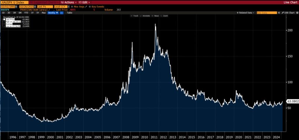
Yes, gold really did go up some 7x relative to the S&P 500 from 2000 to 2012.
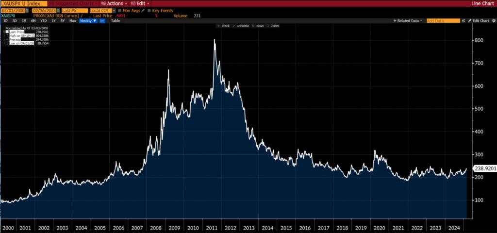
Is that a bottom being hammered out ever since 2018? Over the last three years, it does look like that trading range is compressing.
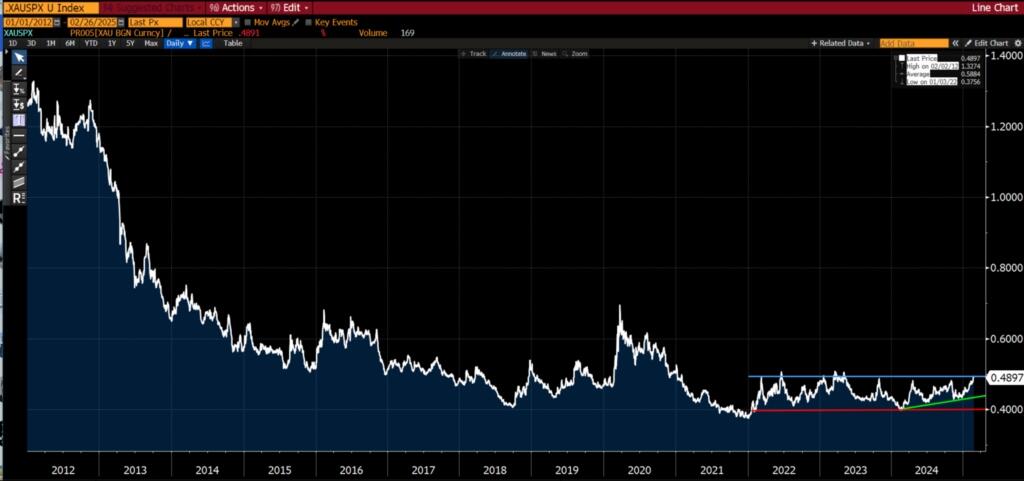
Putting on our “technical analysis” hats…
Given…
-
the length of time for which gold has underperformed the S&P 500 (15 years),
-
the magnitude to which gold has underperformed the S&P 500 (50%),
-
the tightening of the trading range over the last 3yrs,
-
And how close gold relative to the S&P 500 is to breaking to a four-year high…
We believe that a bull market is on the verge of starting for which the duration and magnitude will surprise everyone (probably including ourselves).
At a minimum, we would expect to see gold up by 100% (relative to the S&P 500) come 2030.
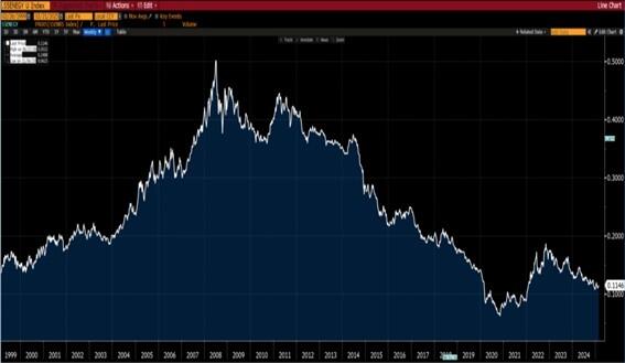
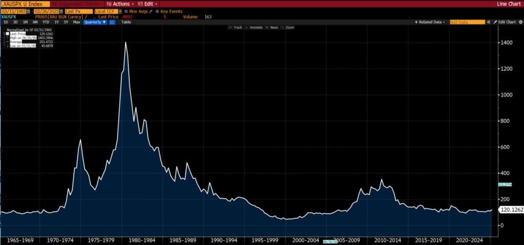
At this point you may be wondering, where does the canary come into it? Gold typically leads the behavior of other commodities.
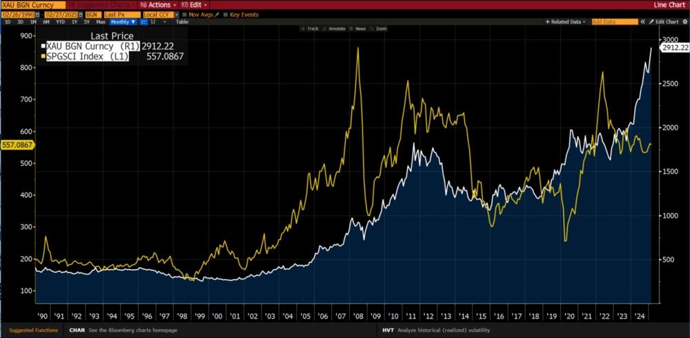
Gold spot and Goldman Sachs Commodity Index
Notice the gap that has opened up between gold and commodity prices? We believe it will close by commodity prices rising to play catchup with gold.
Anyway, higher commodity prices mean higher inflation, which also means higher interest rates. In that environment, you don’t want to be in growth stocks, least of all the Magnificent 7.
* * *
The Western system is undergoing substantial changes, and the signs of moral decay, corruption, and increasing debt are impossible to ignore. With the Great Reset in motion, the United Nations, World Economic Forum, IMF, WHO, World Bank, and Davos man are all promoting a unified agenda that will affect us all. To get ahead of the chaos, download our free PDF report “Clash of the Systems: Thoughts on Investing at a Unique Point in Time” by clicking here.
Authored by Chris Macintosh via InternationalMan.com,
As each year passes, we have come to appreciate Bob Farrell’s 10 Investment Rules.

Perhaps this is because we have been through “a few” cycles and have seen his “rules” play out:
-
Markets tend to return to the mean over time.
-
Excesses in one direction will lead to an opposite excess in the other direction.
-
There are no new eras; excesses are never permanent.
-
Exponential rapidly rising or falling markets usually go further than you think, but they do not correct by going sideways.
-
The public buys the most at the top and the least at the bottom.
-
Fear and greed are stronger than long-term resolve.
-
Markets are strongest when they are broad, and weakest when they narrow to a handful of blue-chip names.
-
Bear markets have three stages — sharp down, reflexive rebound, and a drawn-out fundamental downtrend.
-
When all the experts and forecasts agree, something else is going to happen.
-
Bull markets are more fun than bear markets.
Granted, these are all rather subjective general “rules”. In hindsight one can see them working, however, when you are in the “here and now” it is always somewhat more challenging.
When you identify a condition of “excess,” there is nothing to say that these excesses will end shortly thereafter. Excesses (new highs or lows) or a topping/bottoming process can go on for a lot longer than you could ever rationally comprehend… as you will see in the charts below. But eventually, these excesses do come to an end for reasons you probably didn’t think of at the time. The returns generated as they mean revert provide such beautiful asymmetry.
Take a look at the “excesses” occurring in macro investment themes listed below (no prizes for guessing that we are positioned for a reversal of these trends).
Value vs Growth
First, let’s recap on the essence of value vs growth:

One could say that the difference comes down to growth expectations. In other words, growth of future earnings.
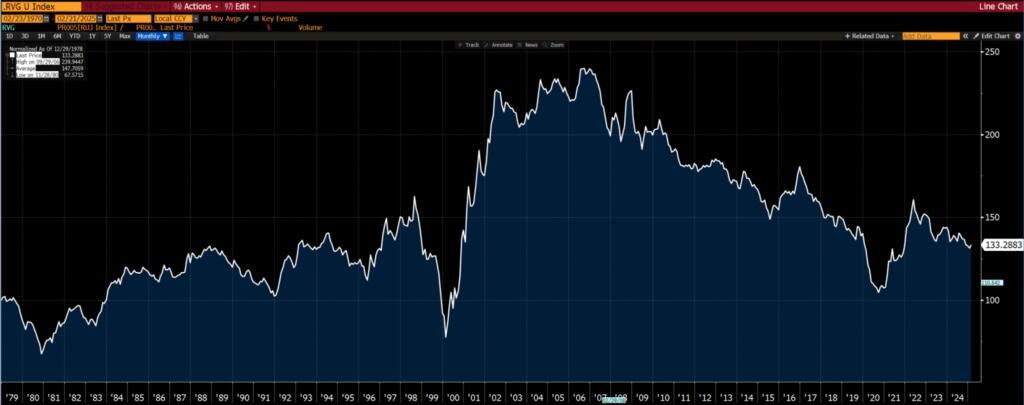
In the US, “value” as an investment theme relative to “growth” is more or less at a 40-year low.

US value vs US growth
From a global perspective, value is as out of favour as it has ever been since the early 1970s and far eclipsing the records set during the dot-com lunacy 25 years ago. It would be interesting if the chart below went back another 50 years.

World value vs world growth
It is not just a large cap thing. The same also extends to small caps.

US small cap value vs small cap growth
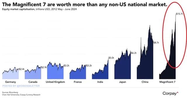
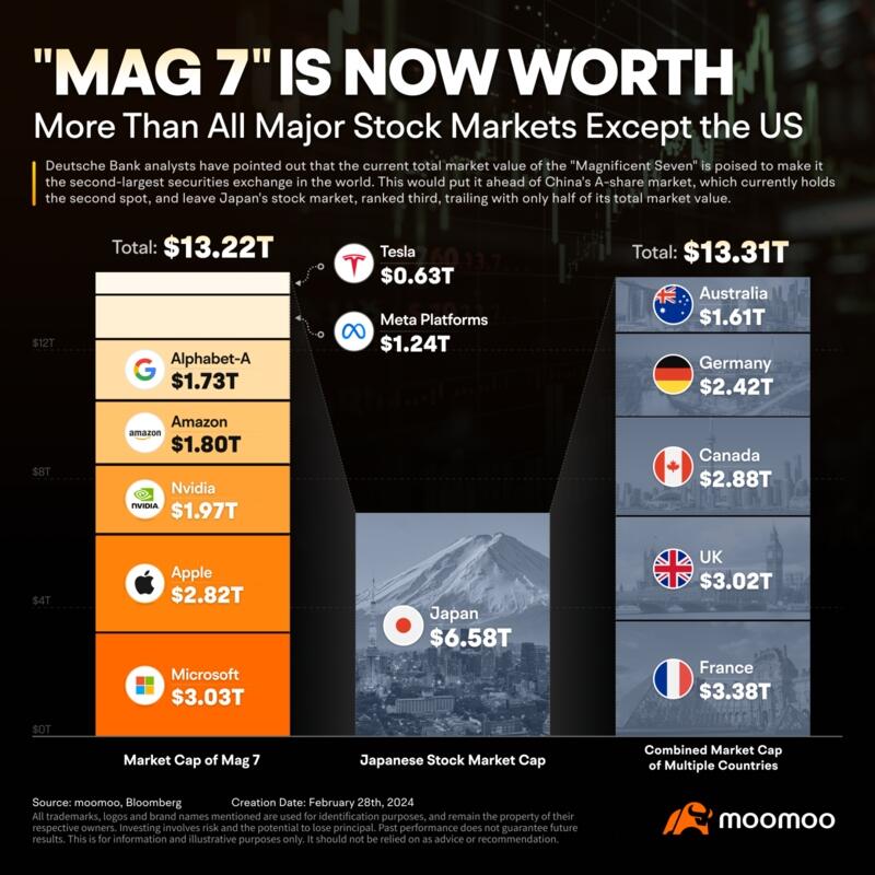
What few have thought about is the ability of “growth” stocks to grow. Many of these companies are now bigger than entire national stock markets.

The Magnificent 7 now account for an eye watering 25% of the market cap of the world stock market (MSCI World).
Surely, the growth rate of these stocks must revert to that of the world stock market? Well, we think so. We believe growth expectations of the Mag 7 will go down as one of the grandest of delusions of all times. Imagine companies becoming larger than countries (when measured by market cap), and furthermore, consider how probable it is for these companies to grow faster than GDP growth rates of countries.
Let’s put it in a slightly different way, for Microsoft to double in value, it needs to attract the same value as the entire French stock market (thereabouts).

Small Caps vs Large Caps
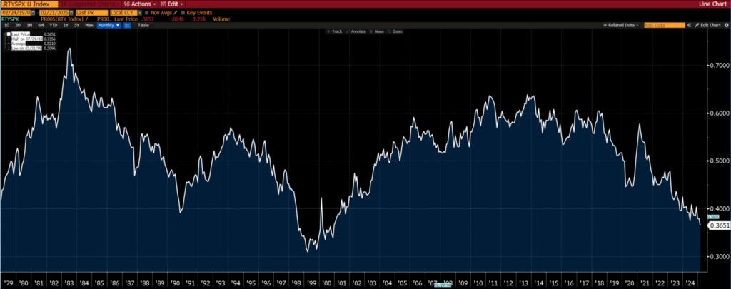
Small caps are about as unloved as they were during the height of the TMT bubble in the late 1990s.

Russell 2000 Index vs S&P 500, both indexed to 100
World vs US Equity Markets
An extreme? Hard to argue that it isn’t. The only debate is the magnitude of the extreme.

MSCI World Ex-US vs MSCI World, both indexed to 100
Emerging Markets vs World Equity Markets
Emerging markets are as out of favour as they were in the late 1990s, after the Asian tiger and LTCM crisis.

MSCI Emerging Markets vs MSCI World, both indexed to 100
Energy vs S&P 500
From a sector perspective, energy has never had such a low weighting in the S&P 500. The chart below (the longest time frame we could find) only goes to mid-2020.

However, if we look at the relative performance of the S&P 500 Energy sector and the S&P 500, you will see that the performance is comparable to 2021 (i.e. the weighting of energy stocks in the S&P 500 hasn’t changed much since late 2020).

Gold Miners vs S&P 500
Almost a replication of the chart above, but notice the long term bottoming formation.

And mining stocks (the S&P 500 Metals and Mining Index which the XME ETF tracks) relative to the S&P 500.

Energy vs Mining
The foregoing discussion begs the question, is energy more out of favour than mining?
If you want a yes/no answer, then yes. Value is easier to find in energy oriented sectors rather than mining.
However, if you give a time frame then things are not black and white. Over the last 10 years, the answer is still yes. But over 20 years and more, there isn’t a clear winner/loser.

S&P 500 Energy Index (XLE) vs S&P Metals and Mining (XME), both indexed to 100
Commodities vs S&P 500
To round it all off, taking the S&P GSCI (the Goldman Commodity Index) as a proxy for the commodity sector (only because it has the longest history)…

Taking the last 35 years, commodities relative to equities are as toxic as they were in the late 1990s. We remember that time. No one wanted to touch them with a 40-foot barge pole, least of all commodity sensitive stocks.

Of course, there is this famous ultra-long term chart produced by Goering and Rozencwajg:

And this one:

Granted, it is some five years old but levels have not changed any since then (using charts above as a proxy).
So in light of the charts above, what is the market implying?
In essence, the market is as perfectly positioned for benign inflation and relatively low interest rates over the next decade as it has ever been over the last couple of generations (at least).
One could also say that the market believes that the inflation we have observed since COVID is transitory and interest rates will be lower a couple of years from now.
Under conditions of low/benign inflation or deflation, commodities and commodity related equities underperform the general equity market (take the S&P 500 as a proxy for the general market).
So if you believe that inflation will surprise to the upside, then you should have a heavy bias towards commodities or commodity sensitive equities in your portfolio.
You get a fair appreciation why our portfolios have almost entirely weighted towards emerging markets, value, and commodity sensitive stocks.
We didn’t so much as look from the top down and decide we want to be these sectors/markets/themes, rather they came up as offering fantastic value from a bottom up perspective. However, from a top down perspective (as in looking at the charts above), we gain an appreciation of the huge asymmetry offered in these sectors/markets/themes.
Of course, it is all easy from an armchair. But when you are at the coal face and patiently waiting, that armchair does start to resemble a rocking chair.

A good moment to remind ourselves that good things take time.
Gold vs S&P 500: The Canary in the Coal Mine
Remember the quiz about the two securities at the start of this publication? It was gold and the S&P 500, specifically gold vs. the S&P 500 indexed to 100 at the start of the time period. So when it is rising (however you define “rising”), gold is outperforming the S&P 500 and vice versa.
Notice the duration of the trends, and don’t be too clinical in terms of how one defines a trend — just eyeball the chart. Trends tend to last for 10 years at least.


Yes, gold really did go up some 7x relative to the S&P 500 from 2000 to 2012.

Is that a bottom being hammered out ever since 2018? Over the last three years, it does look like that trading range is compressing.

Putting on our “technical analysis” hats…
Given…
-
the length of time for which gold has underperformed the S&P 500 (15 years),
-
the magnitude to which gold has underperformed the S&P 500 (50%),
-
the tightening of the trading range over the last 3yrs,
-
And how close gold relative to the S&P 500 is to breaking to a four-year high…
We believe that a bull market is on the verge of starting for which the duration and magnitude will surprise everyone (probably including ourselves).
At a minimum, we would expect to see gold up by 100% (relative to the S&P 500) come 2030.
At this point you may be wondering, where does the canary come into it? Gold typically leads the behavior of other commodities.

Gold spot and Goldman Sachs Commodity Index
Notice the gap that has opened up between gold and commodity prices? We believe it will close by commodity prices rising to play catchup with gold.
Anyway, higher commodity prices mean higher inflation, which also means higher interest rates. In that environment, you don’t want to be in growth stocks, least of all the Magnificent 7.
* * *
The Western system is undergoing substantial changes, and the signs of moral decay, corruption, and increasing debt are impossible to ignore. With the Great Reset in motion, the United Nations, World Economic Forum, IMF, WHO, World Bank, and Davos man are all promoting a unified agenda that will affect us all. To get ahead of the chaos, download our free PDF report “Clash of the Systems: Thoughts on Investing at a Unique Point in Time” by clicking here.
Loading…