Gold and oil - two of the most influential commodities on the planet - have a fascinating relationship that has evolved over decades, captured in the gold-to-oil ratio.
The gold-to-oil ratio represents the number of barrels of crude oil equivalent in price to one troy ounce of gold.
It is viewed as an indicator of the health of the global economy, indicating when gold or oil prices are significantly out of balance with each other.
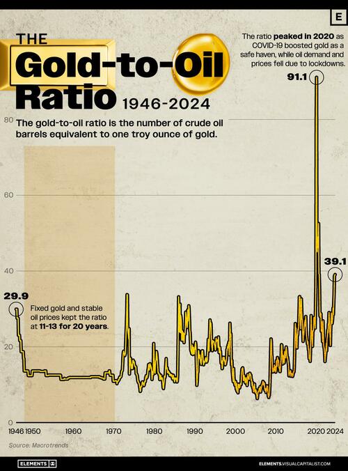
This graphic, via Visual Capitalist's Niccolo Conte, shows the gold-to-oil ratio since 1946, using data compiled by Macrotrends.
What is the Gold-to-Oil Ratio?
The gold-to-oil ratio expresses the price relationship between gold and West Texas Intermediate (WTI) crude oil. WTI is a grade of crude oil and one of the three primary benchmarks for oil pricing, along with Brent and Dubai Crude.
A high ratio indicates that gold is relatively expensive compared to WTI crude oil, and vice versa. This can indicate periods of outsized demand for energy in the form of crude oil, or periods of monetary uncertainty when there is higher demand for gold.
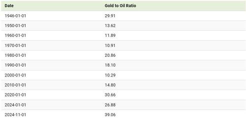
Below is the gold-to-oil ratio every decade between 1946 and 2024.
During the 1950s and 1960s, fixed gold prices and stable oil prices kept the ratio between 11 and 13 for 20 years.
Since the 1980s, the ratio has typically traded within the range of 6 to 40 with a notable exception: in 2020 when the ratio reached a high of 91.1. The peak in 2020 was driven by COVID-19, which boosted gold prices as a safe haven while oil demand and prices plummeted due to global lockdowns.
In contrast, between 2000 and 2008, oil prices were relatively high compared to gold. During this period, the ratio dropped to nearly 6 but never rose above 16.
When comparing the two commodities, it’s worth remembering that the crude oil market is around 10 times larger than that of gold, making it the largest commodity market in the world.
If you enjoyed this graphic, make sure to check out this graphic that shows the top countries by natural resource value.
Gold and oil – two of the most influential commodities on the planet – have a fascinating relationship that has evolved over decades, captured in the gold-to-oil ratio.
The gold-to-oil ratio represents the number of barrels of crude oil equivalent in price to one troy ounce of gold.
It is viewed as an indicator of the health of the global economy, indicating when gold or oil prices are significantly out of balance with each other.
This graphic, via Visual Capitalist’s Niccolo Conte, shows the gold-to-oil ratio since 1946, using data compiled by Macrotrends.
What is the Gold-to-Oil Ratio?
The gold-to-oil ratio expresses the price relationship between gold and West Texas Intermediate (WTI) crude oil. WTI is a grade of crude oil and one of the three primary benchmarks for oil pricing, along with Brent and Dubai Crude.
A high ratio indicates that gold is relatively expensive compared to WTI crude oil, and vice versa. This can indicate periods of outsized demand for energy in the form of crude oil, or periods of monetary uncertainty when there is higher demand for gold.
Below is the gold-to-oil ratio every decade between 1946 and 2024.
During the 1950s and 1960s, fixed gold prices and stable oil prices kept the ratio between 11 and 13 for 20 years.
Since the 1980s, the ratio has typically traded within the range of 6 to 40 with a notable exception: in 2020 when the ratio reached a high of 91.1. The peak in 2020 was driven by COVID-19, which boosted gold prices as a safe haven while oil demand and prices plummeted due to global lockdowns.
In contrast, between 2000 and 2008, oil prices were relatively high compared to gold. During this period, the ratio dropped to nearly 6 but never rose above 16.
When comparing the two commodities, it’s worth remembering that the crude oil market is around 10 times larger than that of gold, making it the largest commodity market in the world.
If you enjoyed this graphic, make sure to check out this graphic that shows the top countries by natural resource value.
Loading…


